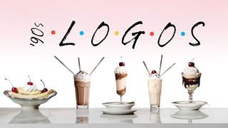
It's safe to say that the '90s is having a moment, and if you were there you'll remember that the sitcom was TV royalty. Thanks to syndication (more on that later), TV branding was suddenly super-important, leading to iconic logo design guaranteed to transport you right back to the Friday nights spent watching Friends on your orange blow up sofa (that can't be just me).
Designer Linus Boman has put the logo designs through the wringer with a fascinating video that unpacks, rates and ranks 10 logos from the biggest shows of the 1990s (alongside some incredible '90s-era graphics, by the way). Check out the video below, then compare them to the best logos ever.
Boman is the creative behind the video, which evaluates logos including Frasier, Seinfeld and Fresh Prince of Bel-Air against the design criteria of distinctness, appeal, storytelling and execution, ranking them from worst to best. But why were TV logos so valued back then?
Well, as Boman explains in the video, the '90s was the era of syndication, meaning there was oodles of money to be made from TV companies licensing TV shows. The show's 'brand' was suddenly important like never before, and the logo was a central part of building that brand – for recognisability, but also for merchandising. I mean, we all remember the cast of six Friends sharing four milkshakes on that poster, right? (No? It's below in case you were one of the few who didn't have it on their wall).

Spoiler: Frasier comes out on top, which is an excellent choice. The smartest sitcom on TV has the smartest logo, with the Seattle skyline forming the basis of the design with a clean, crisp line drawing. The Frasier title changes colour depending on the season, and there are Easter Eggs a-plenty, with helicopters or rising suns appearing behind the skyline. See the logo's evolution through the seasons in the below video.
It's certainly got more to it than the Friends logo design, which Boman says you could have sketched on a napkin and called it a day. Though people claim the six dots represent the six cast members, Boman disagrees and thinks there was no intentionality in that respect – after all the minimalism of the logo is at odds with the maximalism of the show's set design so there's no continuity there. To find out where that comes in the roundup, you'll have to watch the video.
We love Boman's channel at CB (in fact, we also covered his video discussing how Microsoft's font history has influenced typography), and implore you to rush over there and check out the rest of his work.


